Good cafe signage does one job well: it helps someone decide what to order in a few seconds — walking past, standing in a queue, or scanning a wall.
Three things make that happen:
- Readable menu boards with a clear hierarchy
- Specials that stand out from the regular line-up
- Window or footpath signage that gives someone a reason to walk in rather than keep walking
Whether you run printed boards, chalkboards or a digital screen, the ideas below are grouped by what they are for — so you can pick what suits your space, your team and your budget rather than doing all of it at once.
How Do You Design a Menu Board People Can Read Fast?
Most cafe menu boards fail for the same reason: too much information competing for attention at the exact moment someone behind a customer is waiting to order. A few practical fixes go a long way.
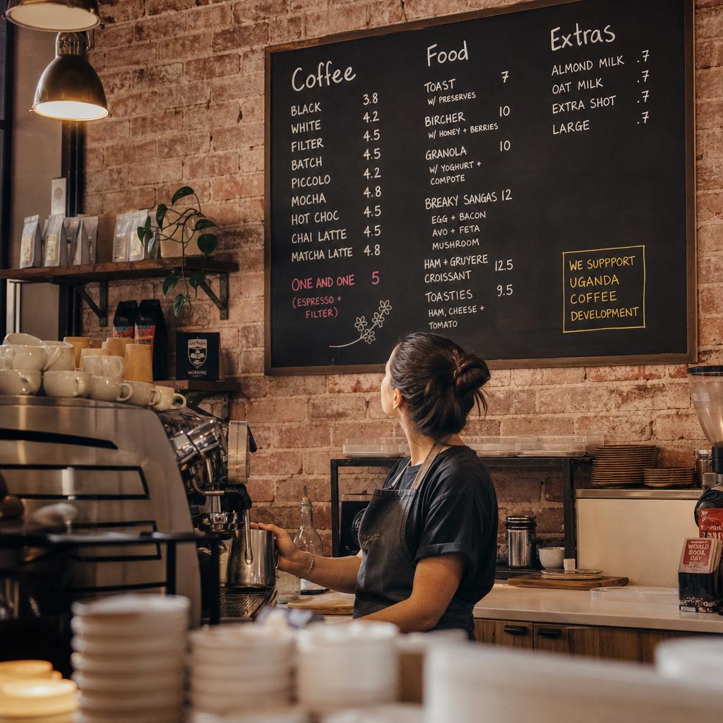
- Group by how people actually order — coffee first, then food, then extras — rather than alphabetically or by supplier category.
- Limit yourself to one accent colour for prices or specials so it actually draws the eye instead of blending into a busy board.
- Keep item names short enough to scan, and move long descriptions (origin story, tasting notes) to a smaller secondary line or a table tent instead of the main board.
- Use consistent price formatting — pick either "$4.50" or "4.50" and stick to it across the whole board, including specials.
- Leave breathing room between sections. A crowded board with no white space is the single most common menu board complaint from customers and staff alike.
- Position the board where it's actually visible from the queue, not just from the counter — test this by standing where your customers stand, not behind the till.
None of this requires new hardware. A static printed or chalkboard menu that follows these rules will outperform a beautifully designed board that ignores them.
How Do You Make Daily Specials Impossible to Miss?
Specials only work if they're visually separated from the permanent menu — otherwise customers scan straight past them.
- Give specials their own physical or visual space — a dedicated chalkboard easel, a separate panel, or a clearly bordered section on a digital screen.
- Lead with the dish or drink name, not the description, then follow with price and a short line if there's room.
- Change specials boards on a routine, even if the change is small — a stale-looking specials board reads as "we forgot," which undercuts the whole point of having one.
- Use specials to move stock that's about to turn, and say so plainly ("today only") rather than leaving a special up for a week, which trains regulars to ignore it.
- Pair specials with a visual cue — a small icon, a different colour panel, or a "today's pick" tag — so returning customers can spot new content at a glance without reading the whole board.
- Keep the specials list short. Three to five items reads as curated; ten reads as a second full menu and defeats the purpose.
Digital or Static Menu Boards: Which Suits a Cafe?
This is the decision most independent cafe owners get stuck on. The honest answer: it depends on how often your offering changes and how much staff time you can spend on it.
Static boards — cheap, reliable, no technical upkeep. But every change means new printing or hand-lettering.
Digital boards — update prices, swap specials or run limited-time promotions from a laptop or phone in minutes.
Digital only earns that back if your menu genuinely changes often: seasonal drinks, daily bakes, price adjustments. Not for its own sake.
| Scenario | Static board | Digital menu board |
|---|---|---|
| Menu changes rarely (monthly or less) | Simple and cost-effective | Overkill for the update frequency |
| Daily or weekly specials | Needs manual rewriting each time | Update once, apply instantly |
| Multiple price changes per year | Reprint or repaint each time | Edit text, no reprint cost |
| Single small cafe, one till point | Easy to manage, low overhead | Useful but not essential |
| Multiple locations or a growing group | Inconsistent boards across sites | One update pushes to every screen |
| Promoting time-of-day offers (breakfast vs lunch) | Requires physically swapping boards | Can be scheduled to change automatically |
| Tight upfront budget | Lower initial cost | Higher upfront cost, lower ongoing effort |
Stay static if: you are a single, well-established cafe with a stable menu. There is no reason to add a screen and a subscription if nothing changes often enough to justify it.
Go digital if any of these apply:
- You run frequent specials
- You serve multiple day-parts
- You have more than one site
In those cases the time saved on reprinting, and the consistency across locations, outweighs the setup cost. Our guide to digital menu boards covers hardware options and setup in more detail.
What Gets People Off the Footpath and Through the Door?
Your menu board only gets seen by people already inside the queue. Outdoor and window signage does the harder job of converting foot traffic that hasn't decided to stop yet.
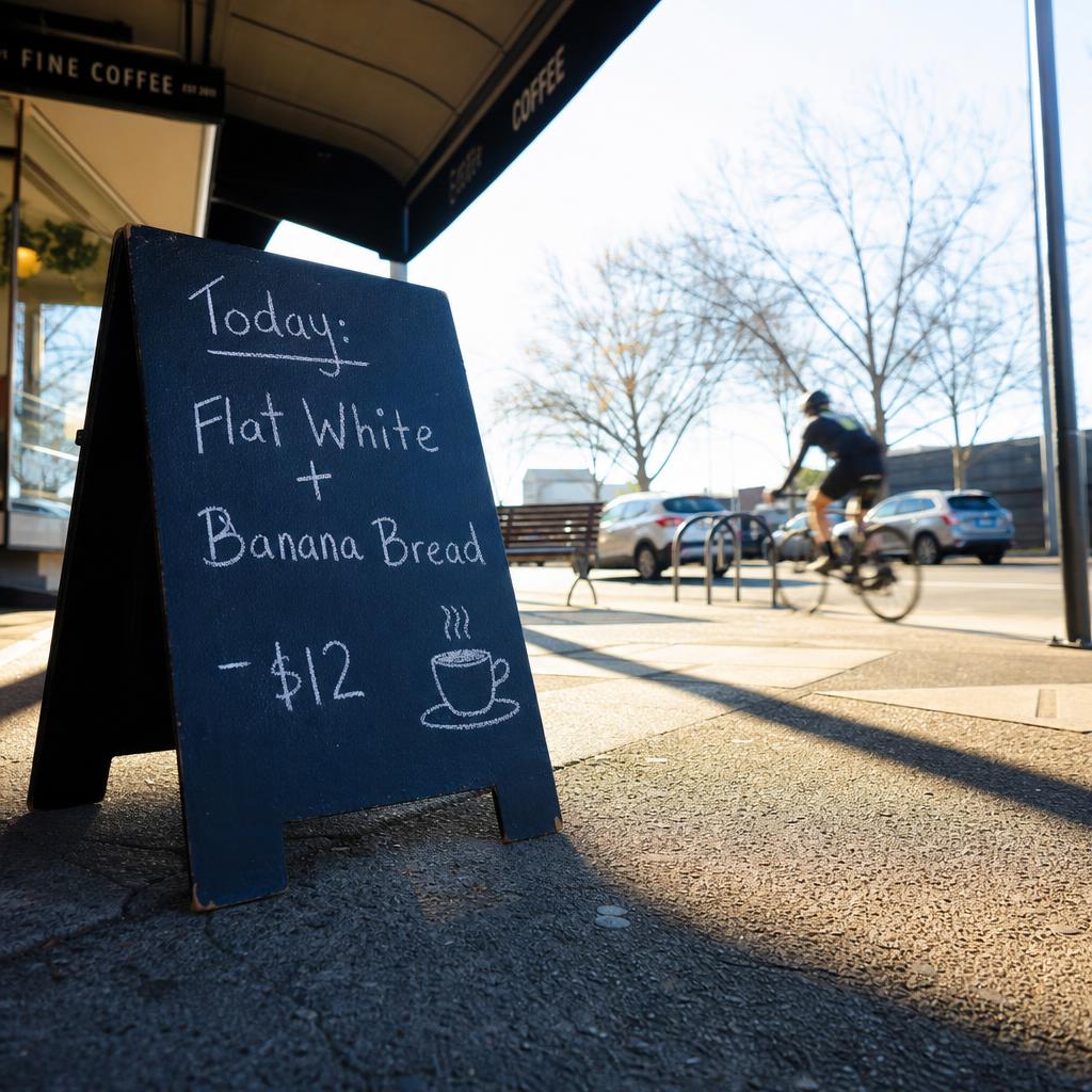
- A-frame or footpath signs work best with one message, not a full menu — a standout item, a price point, or "coffee + food from $X" is easier to absorb while walking than a list.
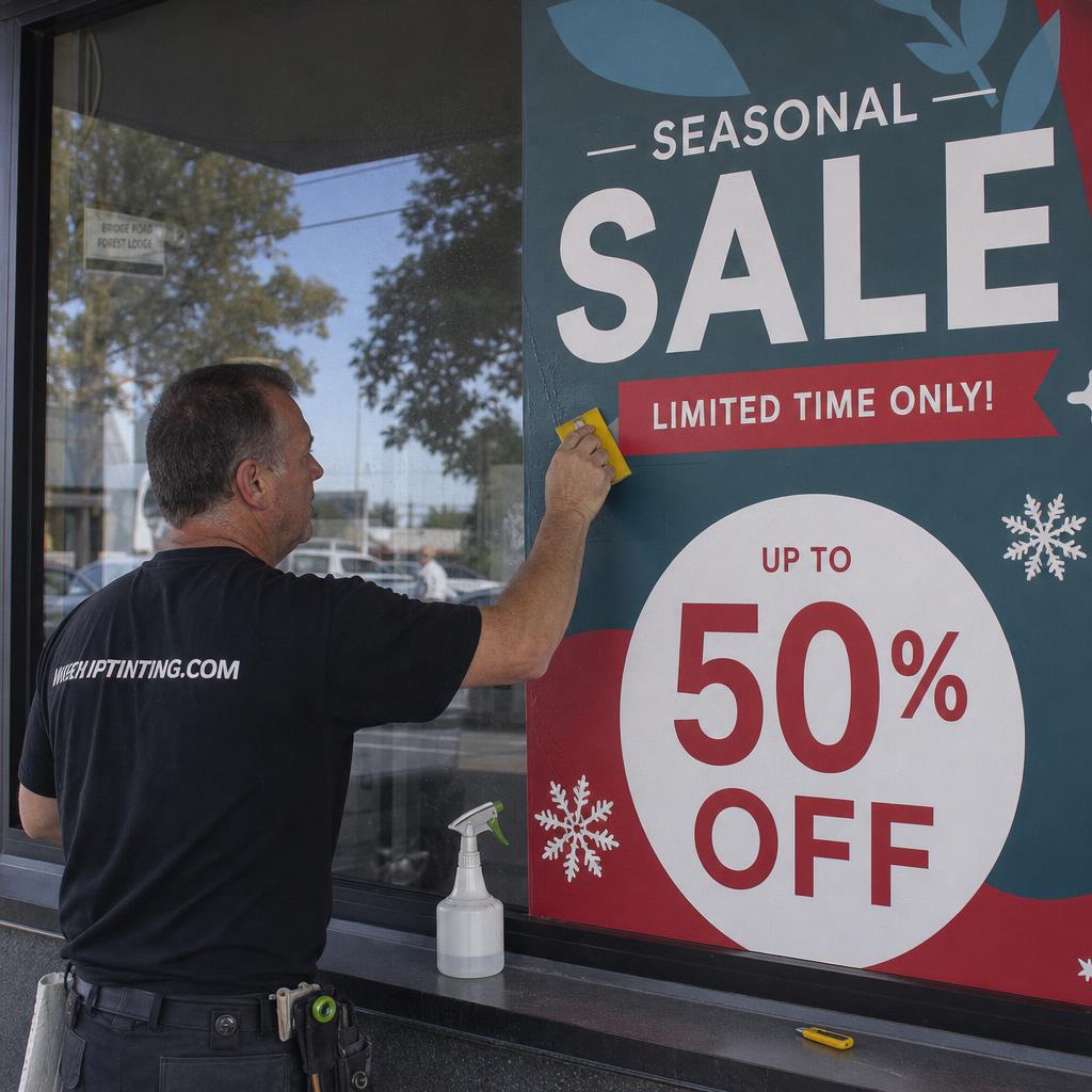
- Window decals should leave sightlines into the cafe, not cover the whole glass — people are more likely to enter a space they can see is warm, busy, or has free seating.
- Put your strongest visual cue at eye level for someone walking, not seated — hanging signs and high shopfront lettering get noticed from further away, but the detail that closes the decision (today's special, opening hours) needs to sit lower.
- Keep opening hours and Wi-Fi availability visible from outside — both are common reasons people choose one cafe over the one next door, and neither should require walking in to find out.
- Refresh window signage seasonally even if the layout stays the same — a shopfront that looks unchanged for a year reads as static to regulars and gives them no new reason to look twice.
- A-boards need to be genuinely legible in direct sunlight and from a car or bike, not just up close — test this at midday, not just when you're setting it up in the morning shade.
What Should the Signage Inside the Cafe Do?
Signage inside the cafe isn't just functional — it shapes how long people stay and how they describe the place to others.
- A consistent typeface and colour palette across menu boards, window signage, and any printed material makes a small cafe look considered rather than assembled piecemeal over time.
- Simple wayfinding signs (toilets, order-here, pickup point) reduce the small friction moments that make a queue feel disorganised, particularly during a morning rush.
- A short brand or origin story sign near the counter gives customers something to read while they wait and reinforces why they're paying cafe prices rather than servo-coffee prices.
- Loyalty program and payment signage should be small, clear, and near the till — not competing with the menu board for attention.
- Table signage (allergen notes, QR ordering, Wi-Fi code) should be uniform across every table, not whatever was printed last and happened to be on hand.
What Should Change With the Seasons?
Cafes that never change their signage tend to blend into the background for regulars, even when the coffee is genuinely good. Rotating content doesn't need to be elaborate to work.
- Seasonal drink or dish boards (a winter warmer, a summer iced special) give regulars a reason to check the board again instead of ordering on autopilot.
- Local event tie-ins — footy finals, a local market day, school holidays — are low-cost signage moments that make a cafe feel connected to its neighbourhood.
- Weather-based prompts (iced drinks pushed harder on a hot day, soup or a hot chocolate on a cold one) are simple for static boards too — just have both versions ready to swap.
- End-of-day or near-closing specials signalled on a small board can move stock that won't keep overnight, without needing a formal discount system.
- A rotating "customer favourite" or "staff pick" tag costs nothing to implement and gives repeat visitors social proof for trying something outside their usual order.
If your specials and seasonal content are working hard enough that you want to measure what's actually selling, our piece on menu board analytics walks through tracking what customers respond to once you're ready for that level of detail — though for most independent cafes, the ideas above will get most of the benefit without needing a full analytics setup.
How Do You Roll This Out on a Tight Budget?
None of this needs to happen at once. Most cafes run lean — often an owner-operator and one or two staff during a shift — so signage changes have to fit around service, not compete with it.
- Start with whichever board causes the most confusion at the till — usually the main menu board or the specials panel — rather than trying to redesign everything simultaneously.
- Standardise a template (for chalkboards, a consistent layout and lettering style; for digital, a saved template) so any staff member can update it correctly without redoing the design each time.
- Decide who owns signage updates. Boards drift out of date fastest when it's genuinely nobody's job to keep them current.
- Budget for signage as an ongoing line item, not a one-off cost — chalk, markers, and printing add up, and digital screens carry ongoing software costs that need to be worth the time they save.
- Test one change before rolling it out everywhere — if you're weighing up a digital screen, trial it on your busiest board first and watch whether it actually reduces the questions your staff field at the counter.
Ready to see whether a digital menu board would save your team time on updates? Book a demo and we'll walk through what it looks like for a cafe your size.
Cafe signage and menu board FAQs
How often should I change my cafe's specials board?
Often enough that regulars notice it's genuinely different, not just refreshed with the same items reworded. Many cafes run a weekly rotation with small daily tweaks. What matters more than frequency is that the board looks intentional — a specials board that hasn't changed in a month trains customers to stop reading it.
Is chalkboard signage still a good option, or is it outdated?
Chalkboard signage still works well for cafes with a strong, casual brand identity and specials that change often but not urgently. It's low-cost and easy for staff to update, though it does rely on someone having decent handwriting and the discipline to keep it current — the same discipline any signage format needs.
How do I make my cafe's opening hours and Wi-Fi details more visible?
Put them on window or door signage, not just inside near the till. These are two of the most common reasons a passer-by chooses one cafe over another, and both should be answerable from outside without needing to walk in and ask.