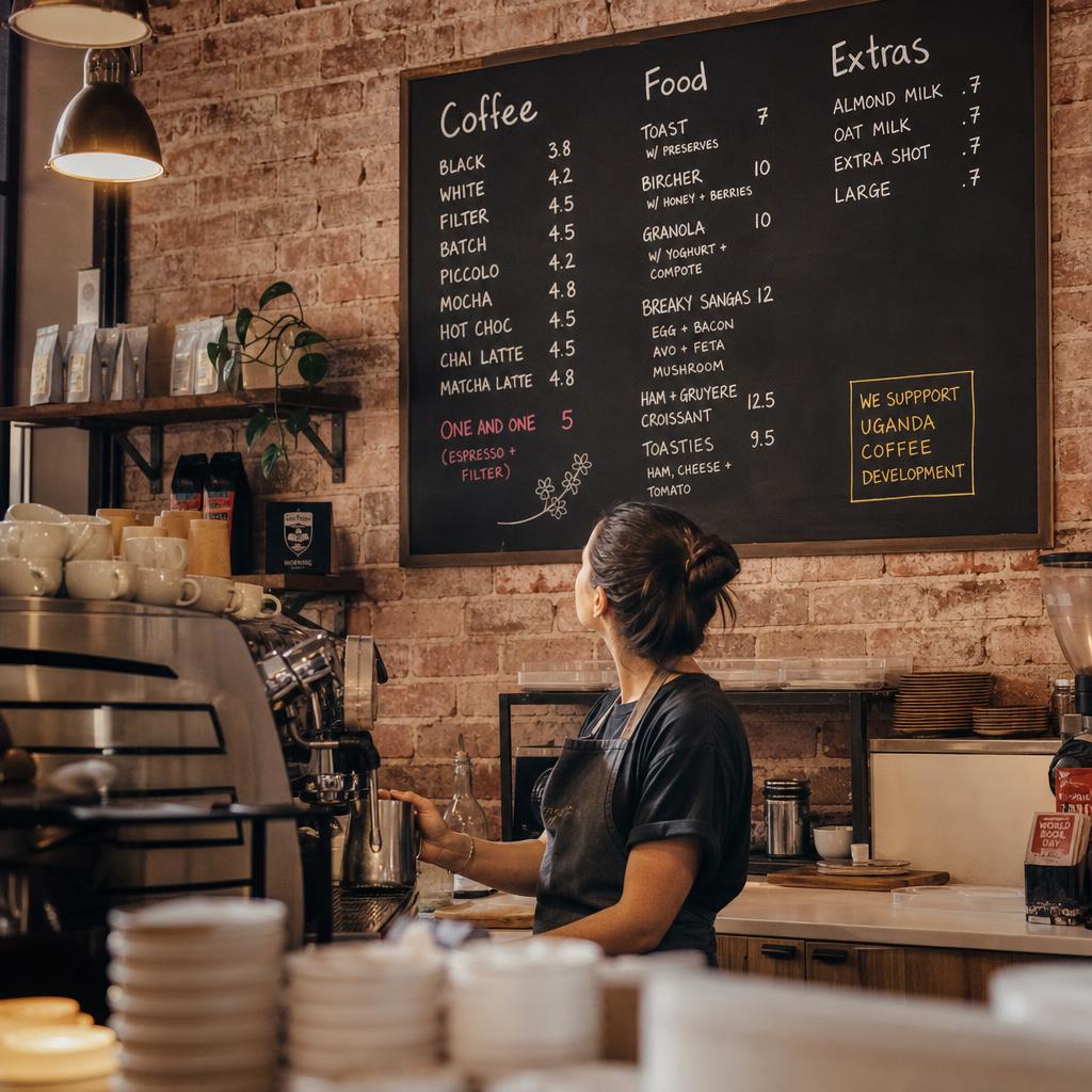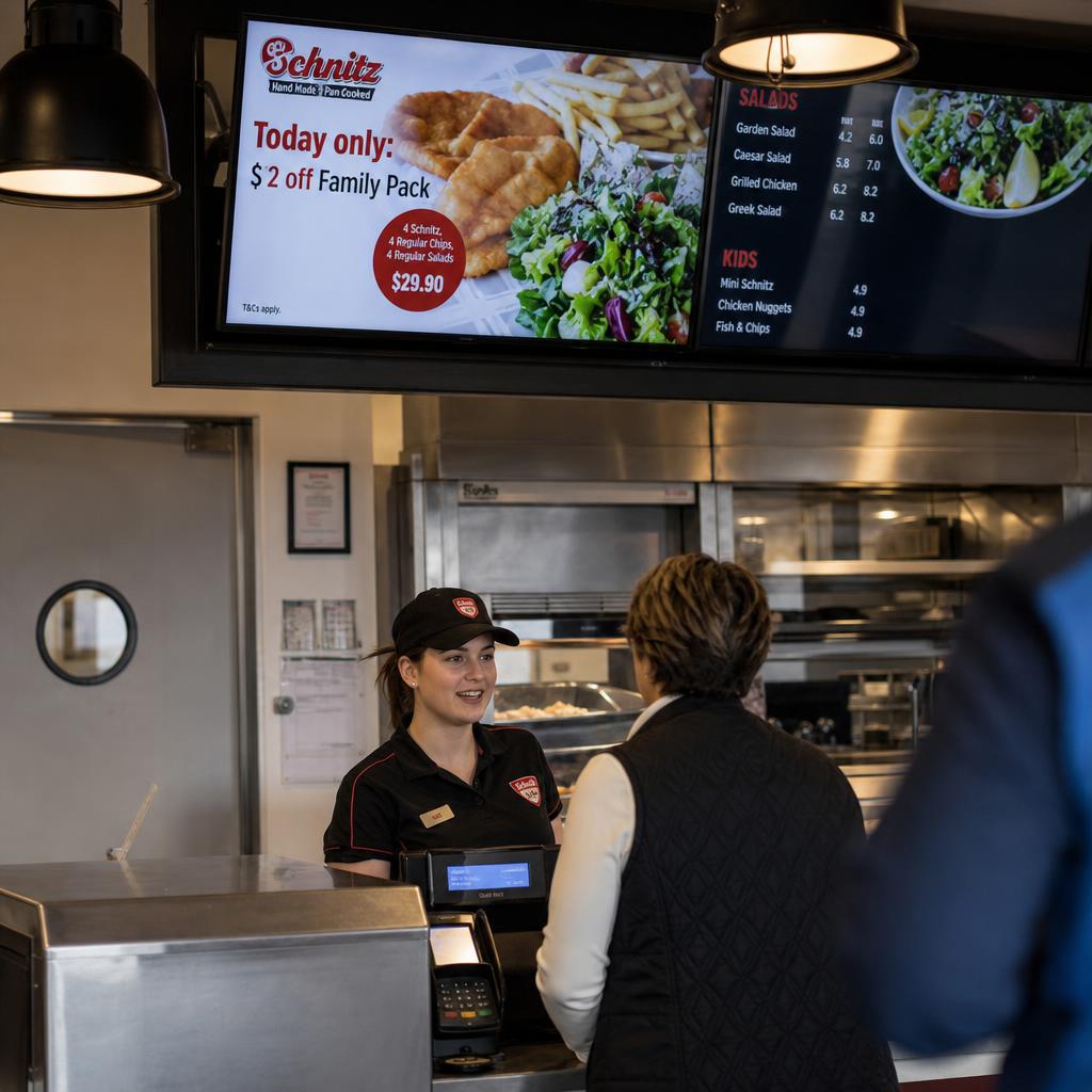
What Is Menu Board Analytics?
Using data to work out which items on a digital menu board are earning their place, then adjusting layout, placement and promotion accordingly.
The data involved:
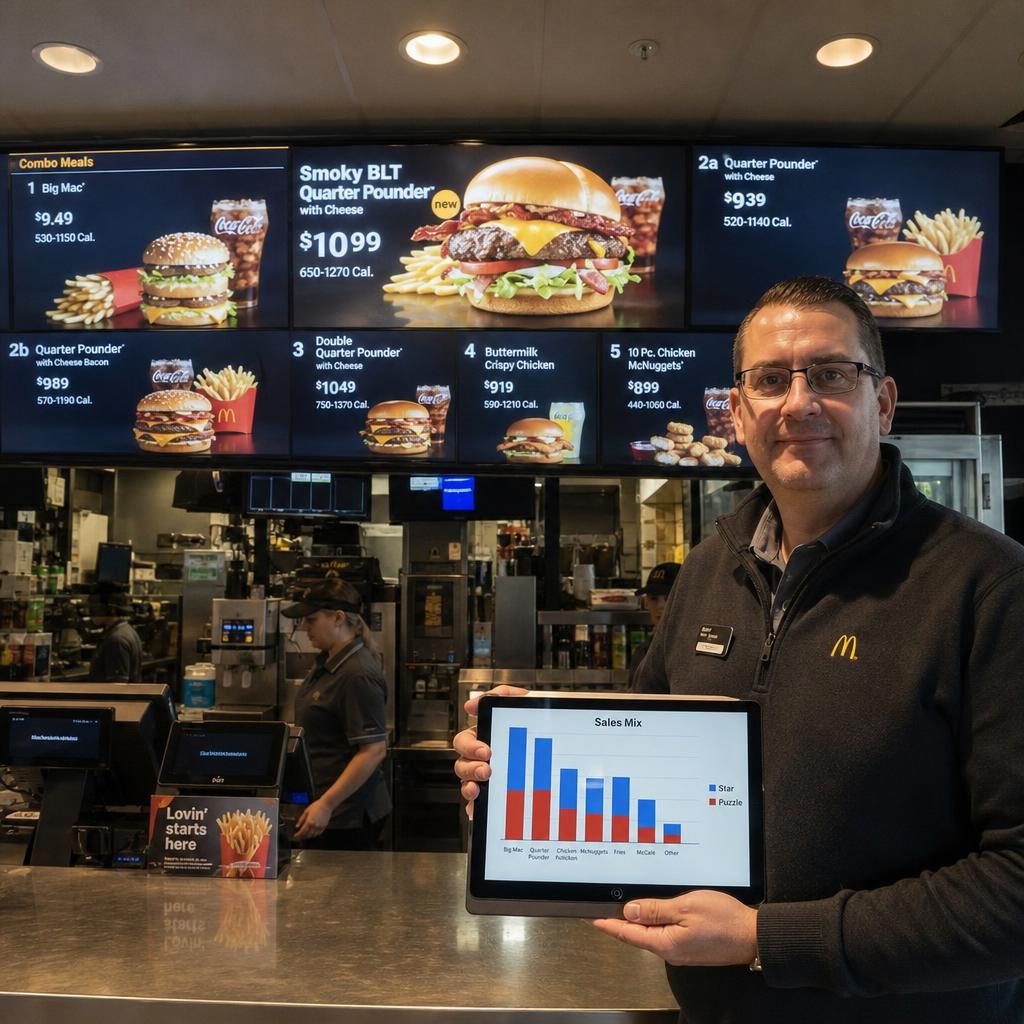
- Sales mix
- Dayparting patterns
- Item-level performance
- Content verification logs
The goal is not displaying a menu. It is using the board as a selling tool that shifts attention toward higher-margin items without touching the price.
If you already have automated scheduling, this is the next layer up. It tells you whether the right items were promoted, whether that changed what people ordered, and what to test next.
Most operators stop at automation. They solve the headache of manually swapping slides between breakfast, lunch and dinner, and never close the loop on whether any of it works.
Menu board analytics closes it by applying an established discipline — menu engineering — to a screen that can actually respond to what the data shows.
What Are Stars, Plow Horses, Puzzles and Dogs?
A decades-old matrix from restaurant consulting, classifying every item on two axes:
- Popularity — how often it sells
- Profitability — contribution margin per item
It was designed for printed menus. It maps cleanly onto digital boards, and digital boards can act on the classification in ways paper never could.
The four, and what each one earns:
- Stars — popular and profitable. They deserve prominent, high-visibility positions.
- Plow Horses — popular but low-margin. They keep customers coming through the door, but do not spend premium screen space pushing what already sells.
- Puzzles — profitable but underordered. Usually a visibility or description problem rather than a product problem.
- Dogs — neither popular nor profitable. The honest answer for most is redesign, reprice or remove.
| Category | Popularity | Profitability | Digital Menu Board Tactic |
|---|---|---|---|
| Stars | High | High | Anchor position, largest imagery, minimal competing clutter nearby |
| Plow Horses | High | Low | Keep visible but don't over-promote; test smaller portion or bundle upsell |
| Puzzles | Low | High | Move to eye-line position, add descriptive copy or imagery, feature in dayparted promo slots |
| Dogs | Low | Low | Deprioritise, bundle into a combo, or rotate out and re-test with new positioning |
The table is a starting classification, not a permanent one. An item's category can shift by daypart, by location, or by season — which is exactly why static classification on a printed menu is a weaker tool than a digital board that can re-sort itself.
What Can a Digital Board Do That Paper Cannot?
Printed menus are frozen at the point of printing. Every item sits in the same spot at 7am and 9pm, on a Tuesday and a Saturday, whether or not that spot is doing any work. Digital menu boards remove that constraint in four practical ways.
Dayparting. A breakfast Puzzle item might be a Star at lunch. Digital boards let you run genuinely different layouts by time of day, so an item's screen position can match its actual performance in that window rather than a single compromise position that's wrong for most of the day.
Dynamic pricing and promotion swaps. Rather than reprinting or hand-swapping physical inserts, price changes, limited-time offers and combo promotions can be scheduled and rotated centrally across a single store or an entire network, then pulled the moment a promotion period ends.
A/B testing layouts. Because content is centrally managed, you can run one layout in a subset of stores or dayparts and a different layout elsewhere, then compare the resulting sales mix. This is the closest a physical retail environment gets to the kind of split-testing that's routine in digital marketing.
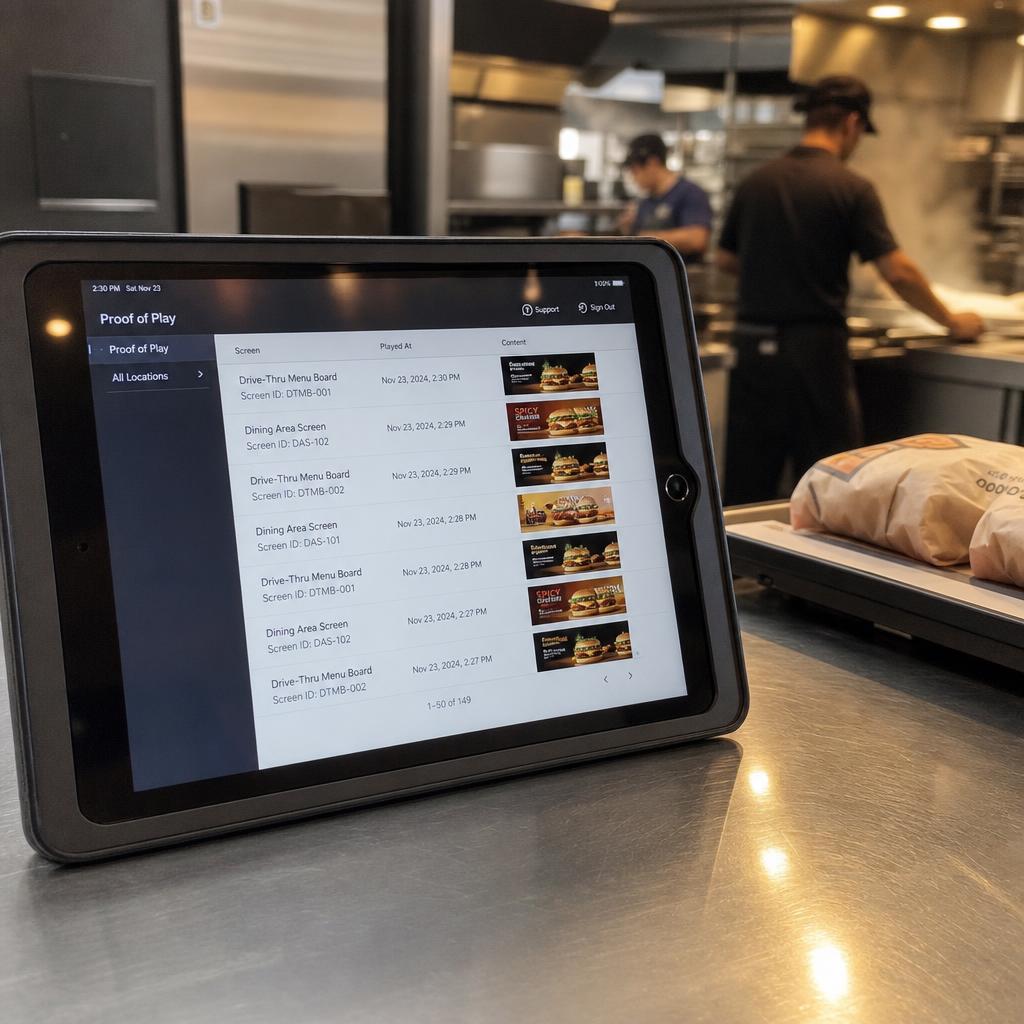
Proof-of-play verification. This is the piece manual scheduling can't offer at all. Proof-of-play logging confirms that the content you intended to show — the Puzzle item you moved to the anchor position, the promo you scheduled for the 11am–2pm window — actually played, on the correct screen, at the correct time. Without it, you're optimising on faith: you assume the board showed what the schedule said, but you have no record to check that assumption against when the sales data doesn't move the way you expected.
Together, these four capabilities are what separate a digital menu board from a screen that just replaced a printed one. If your current setup only handles the scheduling problem — swapping content automatically — read our piece on the real cost of manual content scheduling for retailers for the case on why that layer needs to exist before analytics can do anything useful on top of it.
Design Principles That Shape What Customers Order
Item placement on a menu board isn't neutral. Customers scan screens the way they scan any visual field — usually starting near the top or centre, following size and colour contrast, and treating repetition or clutter as a signal to move on. A few well-established principles matter most:
- Eye-line and entry-point positioning. The zone a customer looks at first (typically upper-centre or the position closest to where they naturally look when approaching the counter) carries more attention than corners or the bottom of a board. This is where Stars and repositioned Puzzles belong.
- Price anchoring. Placing a higher-priced item near a mid-range item can make the mid-range option look like the sensible choice by comparison. This is a well-documented pricing psychology principle, not something specific to any one platform — it works because customers judge price relative to what's nearby, not in isolation.
- Visual hierarchy. Size, imagery quality and whitespace tell customers what matters before they read a single word of copy. An item photographed well and given breathing room reads as a recommendation; an item crammed into a dense list reads as an afterthought, regardless of how good it actually is.
- Limiting choice overload. Boards packed with every available item and modifier tend to slow decisions and push customers toward familiar, lower-margin defaults. Curating what's shown — particularly during peak ordering windows — reduces decision friction and gives Stars and Puzzles more relative visual weight.
None of these principles are unique to digital signage. What digital menu boards add is the ability to apply them differently by daypart, test variations, and roll changes out network-wide in minutes rather than reprinting anything.
Building a Data-Driven Optimisation Cycle
Menu board analytics only pays off if it's run as a cycle, not a one-off redesign. A practical version looks like this:
- Classify. Pull sales mix and margin data for a defined period and sort current menu items into Stars, Plow Horses, Puzzles and Dogs, ideally by daypart rather than as a single all-day view.
- Reposition. Move Puzzles into higher-visibility zones, protect Stars from clutter, and decide what happens to Dogs — bundle, reprice, or retire.
- Verify. Use proof-of-play logs to confirm the new layout actually played as scheduled, on the correct screens, during the correct windows. This step is what stops a false conclusion — assuming a layout change didn't work when it never actually displayed correctly.
- Measure. Compare sales mix for the affected items across the test period against the prior baseline, controlling for obvious confounders like weather, local events or a competitor promotion running nearby.
- Iterate. Reclassify and repeat. An item that moves from Puzzle to Star doesn't stay a Star forever — customer preferences, input costs and competitor activity shift the matrix over time.
The cycle is deliberately unglamorous. It's closer to ongoing retail merchandising discipline than a one-time creative project, and that's precisely why proof-of-play verification and centralised scheduling matter — without them, step 3 is impossible to trust, and everything built on top of it is guesswork.
Common Mistakes That Undermine Menu Board Analytics
A few patterns show up repeatedly in operators who try menu board optimisation and get inconsistent results:
- Redesigning without a baseline. Changing item placement without first recording the prior sales mix makes it impossible to know whether a change actually helped.
- Testing too many variables at once. Swapping imagery, price, position and copy simultaneously means you can't tell which change moved the numbers, or whether they cancelled each other out.
- Ignoring dayparts. Treating the menu board as one static layout across breakfast, lunch and dinner wastes the biggest advantage digital boards have over print.
- Skipping verification. Assuming scheduled content played correctly, rather than checking proof-of-play records, leads to false conclusions about what worked and what didn't.
- Chasing popularity alone. Promoting whatever already sells the most (Plow Horses) rather than profitable-but-underordered items (Puzzles) leaves margin on the table even as topline volume looks healthy.
Getting Started With SPARC
Analytics needs an operational foundation underneath it: reliable scheduling, dayparting and content verification.
SPARC's digital menu board software is built for that:
- Centralised control across single stores or national networks
- Dayparted layouts
- Proof-of-play verification, so you know what actually displayed — not just what was scheduled
For broader design ideas beyond QSR-specific optimisation, our guide to cafe menu board design ideas covers the wider creative territory.
If you're already running digital boards and want to move from "the schedule works" to "the board is actively improving margin," the next step is seeing the analytics and verification layer in action. Book a SPARC demo and we'll walk through how it applies to your menu and your store footprint.
Digital menu board FAQs
What is the Stars, Plow Horses, Puzzles and Dogs framework?
It's a long-established menu engineering matrix that classifies menu items by popularity and profitability. Stars are popular and profitable; Plow Horses are popular but low-margin; Puzzles are profitable but underordered; Dogs are neither. The classification guides where and how prominently each item should appear on the board.
Does moving an item's position on the board actually change what customers order?
Position, price anchoring and visual hierarchy are well-documented influences on customer choice in hospitality and retail settings generally. The reliable way to know the effect for your specific menu and customer base is to test a change against a recorded baseline for that item, rather than assuming any one placement principle will produce the same result everywhere.
Do we need automated content scheduling before we can do menu board analytics?
Effectively, yes. Menu board analytics assumes you can reliably change layouts by daypart, run tests, and trust that scheduled content played correctly. If content is still being swapped manually, that operational gap needs solving first — see our piece on the cost of manual content scheduling for retailers for what that looks like in practice.