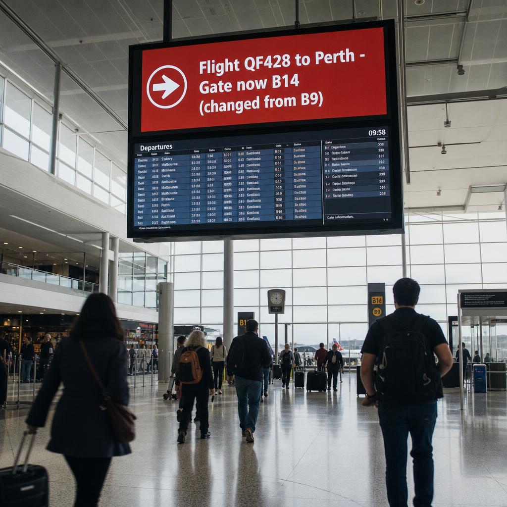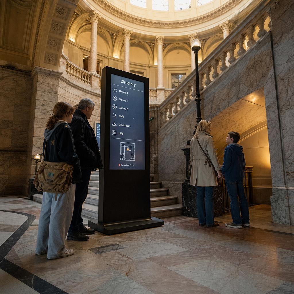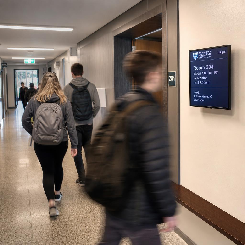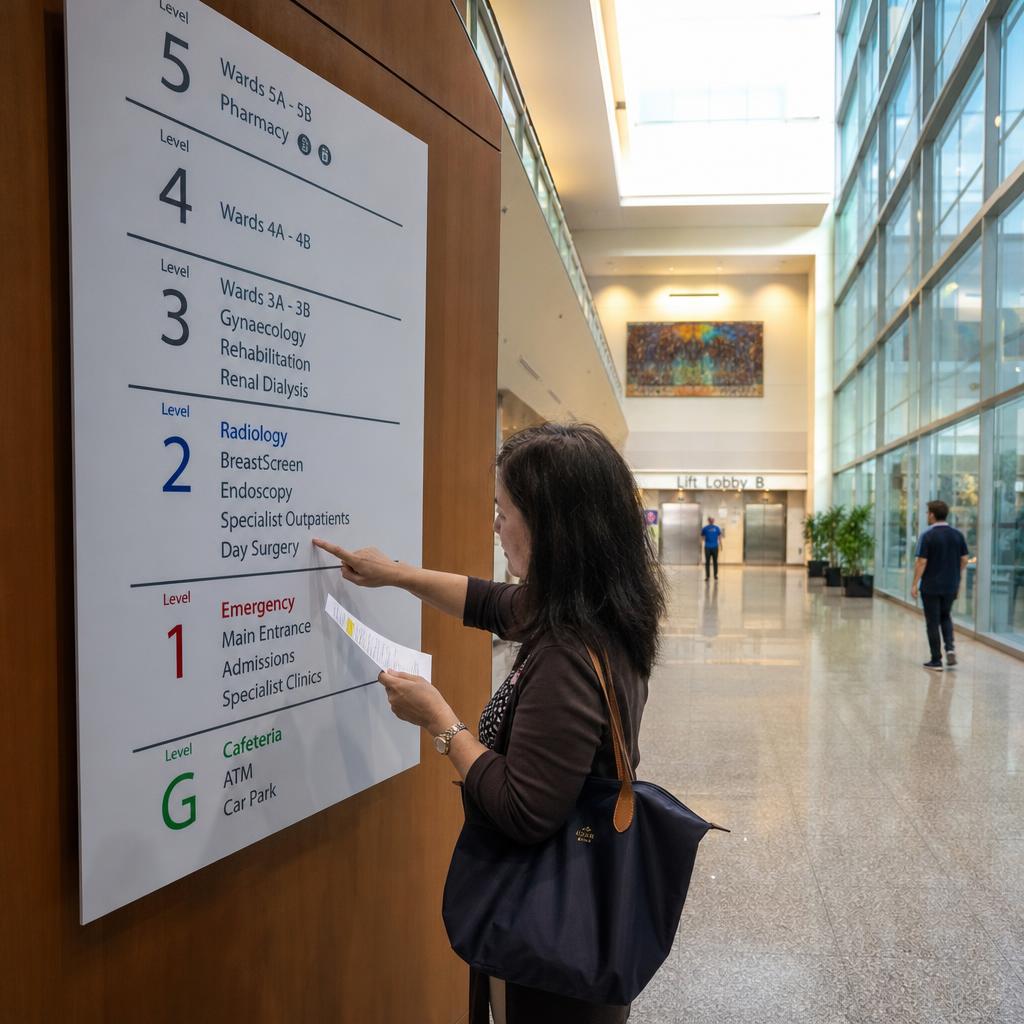
Wayfinding signage is the system of signs, maps and visual cues that helps people navigate a space — from the moment they arrive to the moment they find what they came for.
Good wayfinding does three things:
- Reduces confusion for first-time visitors
- Cuts staff interruptions for directions
- Shapes how people feel about a space before they reach their destination
It applies equally to shopping centres, hospitals, corporate offices, university campuses, airports and public buildings. The same core principles hold whether the signage is a printed panel bolted to a wall or a network of digital displays.
This guide covers the fundamentals of wayfinding design that apply across industries, the practical difference between static and digital wayfinding systems, and how to plan, place, and test a wayfinding system that actually works for the people using it.
Core Principles of Effective Wayfinding Design
Every well-designed wayfinding system, regardless of venue, is built on the same handful of principles.
Consistency. A wayfinding system is only as strong as its weakest link. Typography, colour coding, iconography, and terminology need to stay consistent from the car park to the front door to the fifth floor. If a lift lobby sign calls a department "Radiology" and a directory two floors down calls it "Imaging", visitors lose trust in the whole system — not just that one sign.
Visual hierarchy. Not all information carries equal weight. Primary destinations (main entrances, lifts, emergency exits) should be the most visually prominent, with secondary and tertiary information — individual room numbers, amenities, minor departments — styled to be found when needed without competing for attention. A sign that tries to say everything at once says nothing clearly.
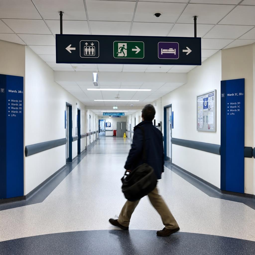
Decision-point placement. Signs matter most at decision points: intersections, lobbies, lift lobbies, and any spot where a visitor has to choose a direction. A common failure mode is over-signing corridors with no choices and under-signing the actual junctions where people hesitate. Mapping decision points before designing sign content is one of the highest-value steps in the entire process.
Legibility and accessibility. Letter height needs to match viewing distance — as a general guide, signage intended to be read from further away needs proportionally larger text. Contrast between text and background matters as much as size; low-contrast colour pairings fail long before the letters get small enough to be the problem. Accessible wayfinding also means tactile and braille signage where required, multilingual or icon-led signage in venues with diverse visitors, and sign mounting heights that work for wheelchair users as well as people standing.
Static vs Digital Wayfinding: Choosing the Right Approach
Not every wayfinding problem needs a screen. The right choice depends on how often the information changes and what else the signage needs to do.
Static wayfinding — printed panels, engraved directories, dimensional lettering — is reliable, has no power or network dependency, and is usually the lower-cost option for information that rarely changes: building addresses, floor numbers, permanent department locations, fire exits, and core circulation routes. Its limitation is exactly its strength: once installed, updating it means physically replacing the sign, which makes it a poor fit for anything that changes regularly.
Digital wayfinding earns its cost where content needs to change: interactive directories, room-booking displays outside meeting spaces, real-time event or queue information, and signage that needs to flex between wayfinding and other messaging (promotions, alerts, arrival boards) depending on time of day. Centralised content management means updates to hundreds of displays can be pushed at once instead of requiring a technician to swap physical panels. The trade-off is higher upfront investment and a dependency on power, network connectivity, and ongoing content management.
Most larger venues use a hybrid model:
- Static signage for permanent, safety-critical and low-change wayfinding — exits, floor identification, core directional signs
- Digital displays for zones where information genuinely changes — lobby directories, meeting room schedules, event wayfinding, and screens combining navigation with other content
SPARC's digital signage features are built for exactly this layered deployment, where digital sits alongside static signage rather than replacing it outright.
Wayfinding by Venue Type
Wayfinding challenges differ significantly by venue, even though the underlying design principles stay the same.
| Venue Type | Primary Wayfinding Challenge | Typical Approach | Key Design Priority |
|---|---|---|---|
| Retail / Shopping Centres | Guiding shoppers to stores, amenities, and promotions across large floor plates | Mixed static directories with digital mall maps at key nodes | Clear zoning and store-name legibility from a distance |
| Healthcare Facilities | High-stress visitors navigating complex, multi-building sites under time pressure | Colour-coded static routes with digital directories at main entrances | Simplicity, calm design, and accessibility for all mobility levels |
| Corporate Offices | Visitors and staff finding meeting rooms, desks, and departments in flexible layouts | Digital room-booking and directory screens, especially in hot-desking environments | Real-time accuracy of room and desk status |
| Education Campuses | New students and visitors covering large, multi-building sites with seasonal changes | Static campus maps supplemented by digital screens at building entries | Durability and resistance to high foot traffic |
| Public / Civic Spaces | Diverse visitors including tourists and non-native speakers needing quick orientation | Icon-heavy static signage with selective digital kiosks | Universal legibility and multilingual or icon-based cues |
The differences are mostly about pace of change and audience diversity, not about fundamentally different design rules. A hospital and a shopping centre both need clear hierarchy and decision-point signage — a hospital just carries a much higher cost of failure when someone gets lost.
Industry-Specific Considerations
A handful of venue types carry wayfinding challenges specific enough to warrant their own deep dive.
Airports are one of the most demanding wayfinding environments in existence, combining time-pressured passengers, multilingual audiences, and constantly changing gate and flight information across enormous, multi-level terminals. The principles in this guide apply, but the operational detail — real-time flight data integration, security-zone routing, and passenger flow management — deserves dedicated treatment. See our guide to airport digital wayfinding and passenger experience for that detail.
Healthcare facilities carry a similar level of complexity, with the added dimension of emergency communications — wayfinding systems that need to switch instantly from routine navigation to evacuation or lockdown messaging. That intersection of everyday wayfinding and emergency protocol is covered in depth in our post on healthcare wayfinding and emergency communications.
Corporate offices and education campuses generally don't need a dedicated deep dive — the venue-type table above, combined with the placement and content guidance below, covers the practical decisions most facilities managers and workplace teams need to make.
Signage Placement Strategy
Placement is where good wayfinding design either succeeds or quietly fails, regardless of how well the individual signs are designed.
Start by mapping every decision point: every spot where a visitor moving from the entrance to a likely destination has to choose a direction.
Walk the actual routes a first-time visitor would take. Do not do this from a floor plan — plans hide sightline problems, awkward columns and blind corners that only appear at eye level.
Sign density matters as much as placement:
- Too few and visitors hit gaps where they have to guess
- Too many and visual noise makes it harder to spot the one that matters
The working rule: a visitor should never walk more than one confirmation distance without a sign either confirming they are on track or presenting the next decision.
Mounting height and sightlines have to account for the real environment, not an empty floor plan:
- Crowds at peak times
- Tall shelving in retail
- Gurneys and equipment in healthcare corridors
- Furniture in office reception areas
Lighting is part of placement too. A well-designed sign in a poorly lit corridor, or a screen facing direct sun with no anti-glare treatment, fails for reasons that have nothing to do with its design.
Content and Design Simplicity
The best wayfinding signage says less, not more. Every additional word or icon on a sign adds a fraction of a second to how long it takes a person to process it — and in decision-point locations, that fraction of a second compounds into hesitation, congestion, and wrong turns.
Three rules cover most of it:
- One name per location, used everywhere — on signs, on maps, in the directory search, and in verbal directions from staff
- Icons supplement text rather than replacing it, except where a symbol is genuinely universal: toilets, lifts, exits
- Colour-code by zone or wing to reduce reliance on reading, which matters most in venues with international visitors or low-literacy audiences
Resist the temptation to use wayfinding signage as a secondary advertising or announcement channel, particularly on digital displays. A directory screen that alternates between room information and unrelated promotional content forces visitors to wait through irrelevant messaging to get what they came for, which undermines the entire purpose of the system.
Testing and Iterating With Real Users
Wayfinding design that looks correct on paper can still fail in practice, which is why testing with real visitors — not just staff who already know the building — is a necessary step rather than an optional one.
The simplest method is a first-time visitor walk-through. Ask someone unfamiliar with the space to find a specific destination unassisted, and watch where they hesitate, backtrack or ask for help.
Repeat it with a handful of people and the same one or two problem points surface every time. Wayfinding failures cluster at specific decision points rather than spreading evenly through a building.
Staff are the cheapest feedback source you have. Reception and front-of-house teams know exactly which directions they are asked for most often, and those questions map directly onto where the system is under-performing.
Run a post-occupancy review a few months after go-live too. Some issues only emerge once real traffic patterns and seasonal changes are in play.
Digital wayfinding has a real advantage here: content changes immediately based on what testing reveals, without reprinting or replacing anything physical.
That flexibility is the strongest argument for digital at the decision points that matter most, even in venues otherwise well served by static signage.
If you already know the two or three points where people get lost in your building, those are the screens worth costing first. Book a demo and we will map wayfinding content against your own floor plan and decision points.
Wayfinding signage FAQs
What is wayfinding signage?
Wayfinding signage is the combined system of signs, maps, digital displays, and visual cues that helps people navigate a physical space from arrival to destination. It includes directional signs, directories, floor and room identification, and any supporting maps or digital tools.
What are the key principles of good wayfinding design?
Consistency in typography, colour, and terminology; a clear visual hierarchy that prioritises primary destinations; signage placed at genuine decision points rather than spread evenly; and legibility and accessibility standards that account for viewing distance, contrast, and diverse visitor needs.
Should I use static or digital wayfinding signage?
It depends on how often the information changes. Static signage suits permanent, safety-critical information like exits and floor numbers. Digital signage suits content that changes regularly, such as room bookings, event directories, or real-time updates. Most larger venues use a combination of both.
How many wayfinding signs does a venue need?
There's no fixed number — it depends on the number of decision points in the space. Mapping every point where a visitor has to choose a direction, by physically walking the space rather than reviewing a floor plan, is the most reliable way to determine sign placement and density.
What makes wayfinding signage accessible?
Accessible wayfinding accounts for letter height relative to viewing distance, strong colour contrast, tactile and braille elements where required, mounting heights suited to wheelchair users, and icon-based or multilingual cues in venues with diverse visitors.
How is digital wayfinding different in an emergency?
Digital wayfinding systems can switch content instantly from routine navigation to emergency messaging, such as evacuation routes or lockdown instructions, across an entire network of displays at once. Static signage relies on separate, dedicated emergency signage that doesn't change. Healthcare-specific emergency wayfinding is covered in our healthcare wayfinding and emergency communications guide.
How often should wayfinding signage be reviewed?
As a general guide, wayfinding should be reviewed whenever the physical layout changes, and otherwise checked periodically — for example, after a renovation, a change in department locations, or observed visitor confusion reported by front-of-house staff. Digital systems make minor content corrections far easier than static signage, since updates don't require reprinting.
What's the difference between wayfinding and directional signage?
Directional signage is one component of a wayfinding system — the arrows and pointers that indicate a specific direction. Wayfinding is the broader system, including directories, maps, identification signage, and the overall design logic that ties them together into a coherent navigation experience.
If you're moving from printed signs to screens, SPARC's digital wayfinding and directory board software shows how directories and directional displays can be managed and updated centrally.